Work with elements
Learn how to structure UI controls in your project.
Read time 4 minutesLast updated 20 days ago
The most basic building block in UI Toolkit is a `VisualElement'. These elements are ordered into a hierarchy tree with parent-child relationships. This is called the visual tree.
Add elements
You need to add elements to the hierarchy to create UI. To add an element to the hierarchy in UI Builder, drag it from the Library tab into the Hierarchy window. You can also double-click on an element in the Library to append it to the Hierarchy. By default, elements aren't named, so they appear in the Hierarchy as their type name.
To name an element, double-click on the item in the Hierarchy, or update the Name attribute in the element's Inspector window.
Unique naming in UI Toolkit isn't enforced, so they're only for identification within the UI. UI Builder doesn't use element names for any internal identification or functionality.
To build a hierarchy, you can drag one or more elements in the Hierarchy to reorder them or move them between parents:

ReorderInHierarchy
You can also drag elements into and from the Canvas, where a yellow line appears to indicate the element placement:

ReorderInCanvas
Manipulate elements
To copy, paste, duplicate, or delete one or more selected elements, right-click on an element and select the option in the menu. You can also use the standard short-cut keys for your operating system.
When you copy an element in the Hierarchy pane, it copies the UXML text representation of the element and its children. This means you can paste it directly into a text editor. You can also copy UXML text and paste it into the UI Builder.
All actions you do to an element are also applied to all its children. For example, deleting an element deletes all its children and duplicating an element replicates the entire sub-tree of elements under it.
Read-only elements
When you drag an element from the Library tab to the Hierarchy tab, you might notice additional child elements appearing in a dimmed state. These are read-only elements. This happens with some built-in UI controls, and some custom elements that create their internal hierarchy upon creation.
When you add child elements to a , children elements are added to the of this parent element. For example, the ScrollView below has one Foldout child element that's inside the . It also has several Scroller child elements that are in the shadow tree. The shadow tree is the hierarchy of child elements that are outside of the of this element.
VisualElementcontentContainercontentContainercontentContainer
The hierarchy of a ScrollView element
As the UI Builder can only edit what it can represent in the UXML Document, it is not possible to edit the internal hierarchy. UXML is not a direct copy of the live UI hierarchy but rather an instruction set.
Attributes in UXML
Elements have per-element attributes which can be set in UXML. You can think of them as a constructor or initialization arguments. This includes the attribute. The base class comes with a few standard attributes that all elements share (since all elements inherit from ), like , , and . More advanced elements and controls have additional attributes you can set, for example, the adds the attribute.
nameVisualElementVisualElementnametooltiptabindexLabeltextChange attributes in the Inspector
All standard and custom attributes appear in the Attribute section at the top of the Inspector window.
You can set the value of an attribute in the attribute section. If the field appears bold with a solid line on the left of the field's label, it means the attribute is already set and not using the default. For example, setting from empty to and then back to empty is different from never setting it in the first place: the first case is while the second case is . What means is there's an entry in the UXML text on this element setting this attribute to value
tooltiptestunsetset to emptythis attribute is seta If the attribute doesn't appear in the UXML file, it's .
not setTo unset an attribute, right-click on the field's label and select Unset.
To unset all attributes, right-click on the field's label and select Unset All.
Change attributes in the Canvas
The only attribute you can change directly in the Canvas is the attribute on text elements such as a or a . To change the attribute in the Canvas, double-click on it in the Canvas.
textButtonLabeltext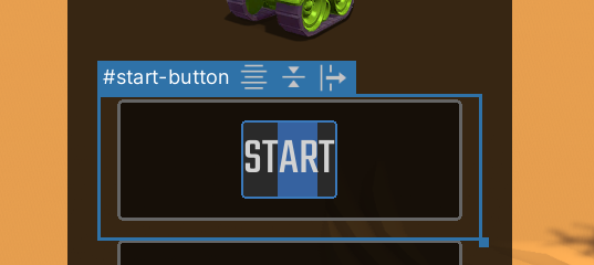
EditButtonTextInCanvas
To commit the change, press the Enter key. If the attribute contains newline characters, use Shift + Enter to commit the change.
textTo cancel the change, press the Esc key.