Custom branding reference
Change Unity Dashboard appearance with custom branding options.
Read time 7 minutesLast updated 21 days ago
Explore asset and color slots you can control with the ConfigMap. To deploy the ConfigMap, refer to Enable custom branding.
shared-assetsCustomizable assets
The ConfigMap holds the following assets:
shared-assets
|
|
|
|---|---|---|
| Primary logo in the application header. | No |
| Compact logo in the sidebar footer when the navigation pane is collapsed. | No |
| Browser tab icon. | No |
| Color palette for the light and dark themes. Applies to both Unity Dashboard and the embedded Asset Manager. | No |
| Stylesheet for fine-tuning logo dimensions, spacing, or other styling that the palette can't reach. | No |
If an asset is missing from the ConfigMap, Unity Dashboard uses the bundled default for that item.
Use the boilerplate ConfigMap as a starting point.
shared-assetsCSS overrides
Use to style elements the palette can't express, such as logo dimensions, brand mark spacing, or detailed data table tweaks. Unity Dashboard loads after its bundled stylesheet, so any rule you provide takes effect without .
overrides.cssoverrides.css!importantCSS hooks for logos
The following table lists the CSS classes you can target:
|
|
|---|---|
| Primary logo in the application header. |
| Compact logo in the sidebar footer when the navigation pane is collapsed. |
The default bundled stylesheet contains the following settings:
.vpc-logo { height: 24px;}.vpc-label-logo { width: 51px; height: 24px;}
Example overrides.css
snippets
overrides.css/* Taller header logo with extra right-side spacing. */.vpc-logo { height: 32px; margin-right: 12px;}/* Square compact mark for the collapsed sidebar. */.vpc-label-logo { width: 32px; height: 32px; object-fit: contain;}/* Tint a monochrome SVG to match the brand accent. Works only if the SVG uses fill="currentColor" or its paths are unstyled. */.vpc-logo { color: #0a6ec8;}.vpc-logo path { fill: currentColor;}/* Reach a region the palette can't recolor: the data table pinned column shadow. */.MuiDataGrid-pinnedColumns { box-shadow: -2px 0 4px rgba(0, 0, 0, 0.08);}
CSS override tips
- Keep the header logo height between 24 and 36 pixels. Larger values increase the header height and break the vertical alignment with the navigation icons.
- The compact logo () is only visible when the sidebar is collapsed. Verify both the expanded and collapsed states after editing.
.vpc-label-logo - Prefer SVGs that use or unstyled paths, so a single CSS rule can recolor them and they respect the active light or dark scheme.
fill="currentColor" - For data table tweaks beyond what the palette allows, target selectors.
.MuiDataGrid-*
Theme palette structure
The file defines two color schemes, and . End users switch between them from the Theme option in the user menu. Both schemes accept the same set of keys.
palette.jsonlightdarkThe default palette file has the following contents:
{ "colorSchemes": { "dark": { "palette": { "primary": { "main": "#0A6EC8", "dark": "#1361AD", "lighter": "#012348", "contrastText": "#C6E4FF" }, "common": { "black": "#000000", "white": "#FFFFFF" }, "divider": "rgba(255, 255, 255, 0.08)", "dividerElevation0": "#3a3a3a", "action": { "hover": "rgba(255, 255, 255, 0.071)", "selected": "#313131", "disabled": "#3a3a3a" }, "error": { "main": "#e5484d" }, "warning": { "main": "#ffc53d" }, "success": { "main": "#30a46c" }, "background": { "default": "#131313", "paper": "#191919", "paperElevation0": "#222222", "modalElevation": "#2a2a2a", "datagridHeader": "#222222" }, "text": { "primary": "#eeeeee", "secondary": "#b4b4b4" }, "grey": { "50": "#111111", "100": "#191919", "200": "#222222", "300": "#2a2a2a", "400": "#313131", "500": "#3a3a3a", "600": "#484848", "700": "#606060", "800": "#6e6e6e", "900": "#7b7b7b" } } }, "light": { "palette": { "primary": { "main": "#0A6EC8", "dark": "#0060B8", "lighter": "#ECF5FF", "contrastText": "#0E345B" }, "common": { "black": "#000000", "white": "#FFFFFF" }, "divider": "rgba(0, 0, 0, 0.1)", "dividerElevation0": "#e8e8e8", "action": { "hover": "rgba(0, 0, 0, 0.059)", "selected": "#e8e8e8", "disabled": "#e0e0e0" }, "error": { "main": "#e5484d" }, "warning": { "main": "#ffc53d" }, "success": { "main": "#30a46c" }, "background": { "default": "#FFFFFF", "paper": "#fcfcfc", "paperElevation0": "#f9f9f9", "modalElevation": "#FFFFFF", "datagridHeader": "#f9f9f9" }, "text": { "primary": "#202020", "secondary": "#646464" }, "grey": { "50": "#fcfcfc", "100": "#f9f9f9", "200": "#f0f0f0", "300": "#e8e8e8", "400": "#e0e0e0", "500": "#d9d9d9", "600": "#cecece", "700": "#bbbbbb", "800": "#8d8d8d", "900": "#838383" } } } }}
You don't need to provide every key. If you omit a key, Unity Dashboard uses the bundled default. A minimal palette can override only , , , and and inherit the rest.
primary.mainprimary.contrastTextbackground.paperbackground.datagridHeaderPalette keys
The following keys are read from the palette and applied to Unity Dashboard.
Brand and accent
|
|
|---|---|
| Brand accent for calls to action, avatars, links, and the selected-tab underline. |
| Hover and active state of contained primary buttons. |
| Text color on contained primary buttons. |
| Background of the selected row in data tables. |
| Initials text on avatars and certain icon fills. |
Backgrounds and surfaces
|
|
|---|---|
| Application canvas behind page content. |
| Cards, panels, headers, sidebars, popovers, modals, table body cells, and side panels. The most-visible surface. |
| Background of a table row under the cursor. |
| Dialogs and modals, including the table column menu and filter panel. |
| Table column header row, pagination footer, and pinned header background. |
Text
|
|
|---|---|
| Page titles, body text, primary navigation labels, and table content. |
| Section labels, captions, email addresses, and descriptive copy. |
Dividers and overlays
|
|
|---|---|
| Borders between elements, plus the chip background in tables. |
| Border of elevated popovers and table menus. |
| Translucent hover tint on icon buttons. |
| Background tint on the selected secondary navigation item. |
| Disabled control affordance. |
Status colors
|
|
|---|---|
| Notification badge, error states, and the In review status. |
| Warning states and the Draft status. |
| Success states, the organization icon, and the Approved status. |
Neutral ramp
The through keys define the neutral color ramp for components that read directly. Provide all 10 steps to keep the ramp continuous.
grey.50grey.900grey.*Palette tips
- Choose first, because it paints the most-visible surface (header, sidebars, popovers, table cells, side panels).
background.paper - Set and
background.defaultto slightly different values (a 5–10% lightness step) so the page reads as elevated. Identical values look flat.background.paper - Set to a value that differs from
background.datagridHeader, so the table header doesn't disappear into the table body.background.paper - controls more than buttons. It also paints avatars, links, and the selected-tab underline. Avoid pure-saturated brand reds because they collide with
primary.main.error.main - is the selected-row background. Keep it visibly tinted but soft enough that the text on top stays readable.
primary.lighter - doubles as the chip background in tables, so don't make it strongly chromatic.
divider
Where each palette key paints
The following screenshots show every region that each slot paints. They were captured with a demonstration palette where each slot has a unique color, so each region is visually distinct. In a real palette, regions that share a slot share the same color.
palette.jsonThe demonstration palette uses these colors:
- : light amber
background.paper, dark deep purple#fff8e1#4a148c - : light blue
background.default, dark navy#e3f2fd#1a237e - : light lavender
background.datagridHeader, dark deep red#e1bee7#b71c1c - (row hover): light peach
background.paperElevation0, dark teal-green#ffccbc#00695c - : light mint
background.modalElevation, dark dark cyan#c8e6c9#006064 - : hot pink
primary.mainin both schemes#ff007f - (selected row): light very-light pink
primary.lighter, dark deep magenta#fce4ec#5a0030 - : orange
dividerin both schemes#ff9800 - : amber
dividerElevation0in both schemes#ffd54f - : light navy
text.primary, dark yellow#1a237e#ffeb3b - : light teal
text.secondary, dark light-teal#00695c#80cbc4 - : orange
action.selectedtranslucent in both schemes#ff9800 - : yellow
action.hovertranslucent in both schemes#ffeb3b - : red
error.main.#f44336: amberwarning.main.#ffc107: greensuccess.main#4caf50
Unity Dashboard shell
The standard signed-in view: top bar, primary navigation, secondary navigation, and content area.
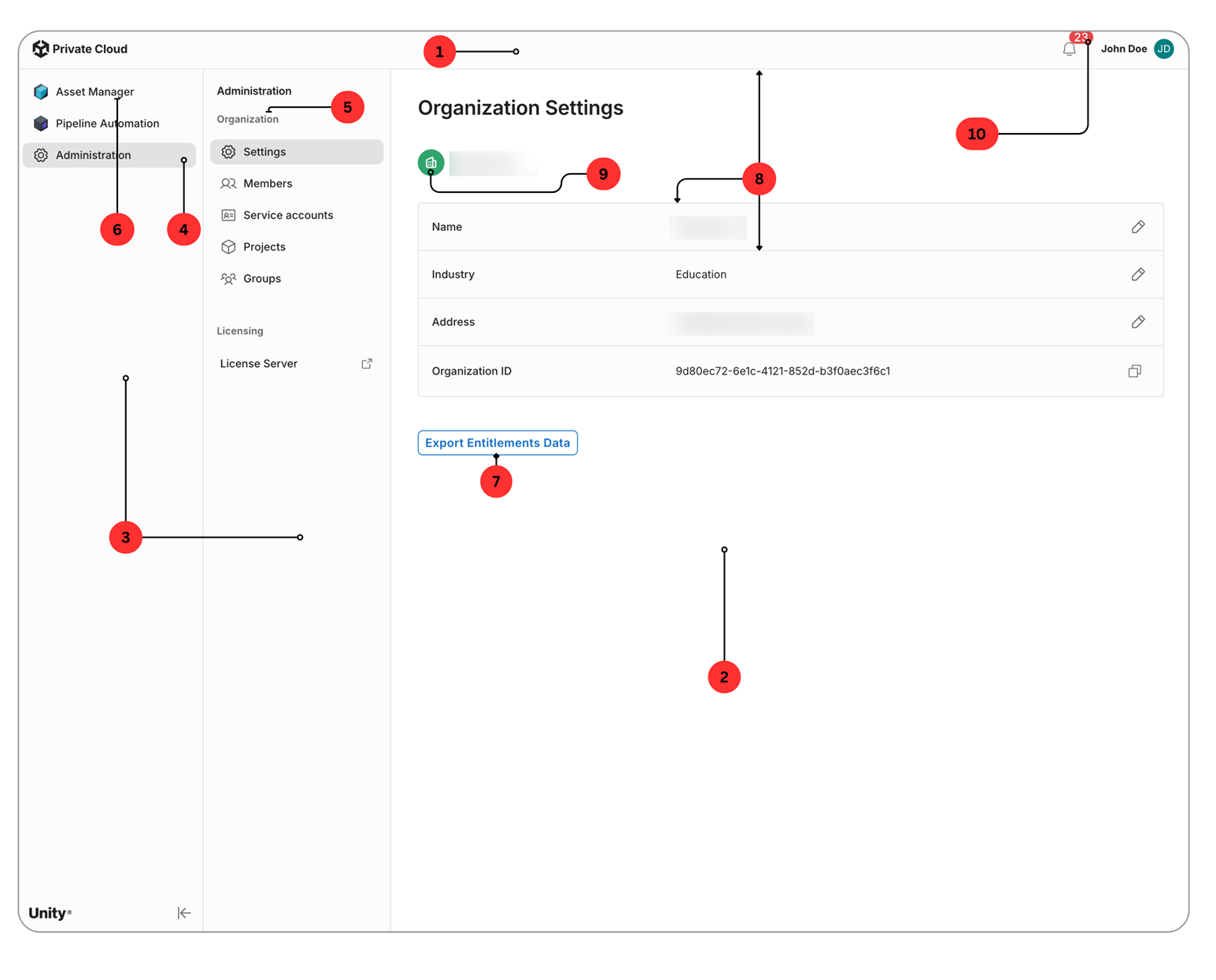
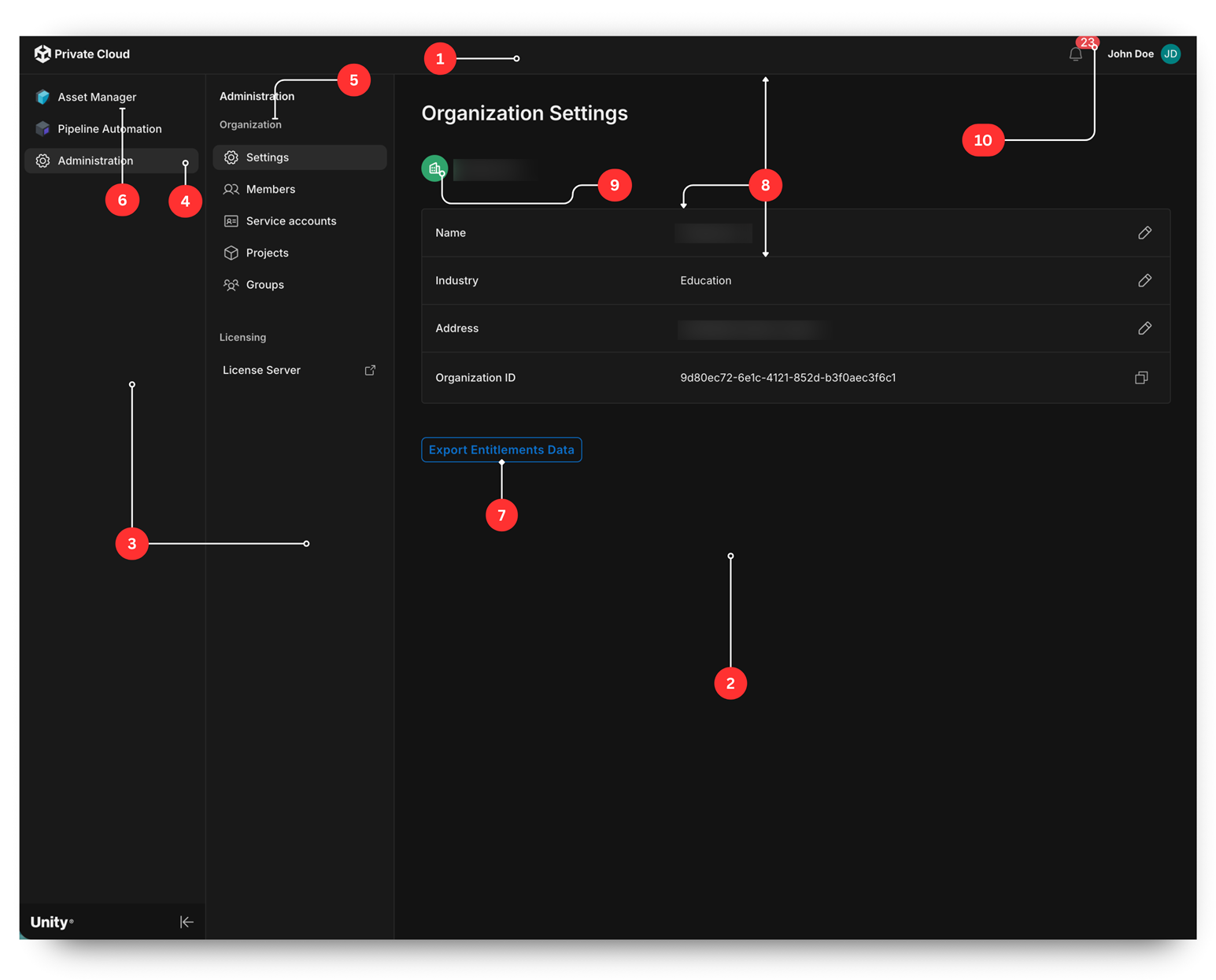
The numbered regions in the screenshots use these palette keys:
- Top bar:
background.paper - Main content canvas behind cards and panels:
background.default - Primary and secondary navigation sidebars:
background.paper - Background of the selected primary navigation item: , applied as a translucent tint over
action.selectedbackground.paper - Section labels in the sidebars (such as Administration, Organization, and Licensing):
text.secondary - Primary navigation labels:
text.primary - Outlined call-to-action button text and border:
primary.main - Borders between rows in the info card:
divider - Organization icon background:
success.main - Notification unread badge:
error.main
User menu popover
The popover that opens from the user avatar in the upper-right corner.
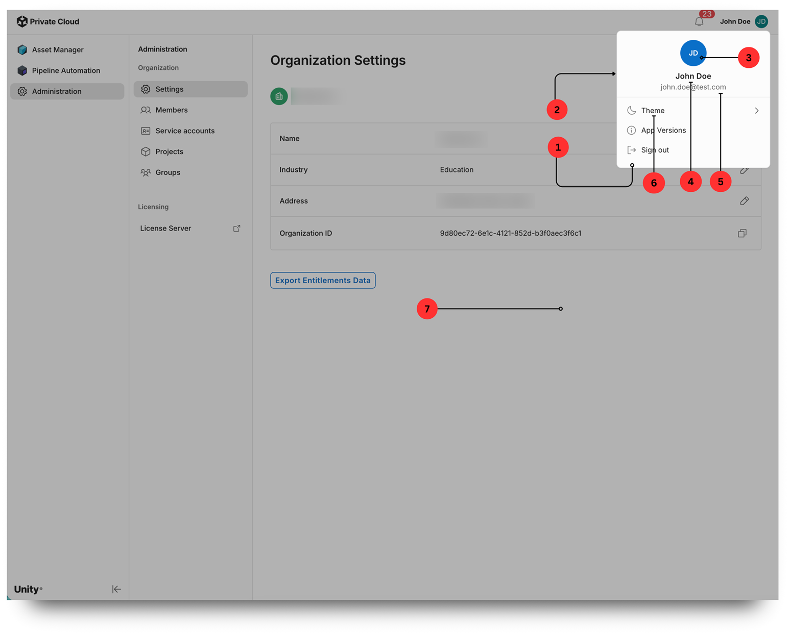
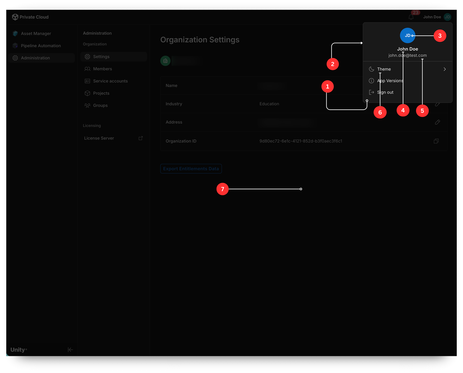
The numbered regions in the screenshots use these palette keys:
- Popover surface:
background.paper - Popover outer border:
divider - Avatar circle when no photo is set: . Initials text:
primary.maincommon.white - User display name:
text.primary - Email address:
text.secondary - Menu item labels:
text.primary - Backdrop dim behind the popover: a semi-transparent overlay that doesn't come from
palette.json
Members table
The Members tab under Administration > Settings. This table uses the shared application table component.
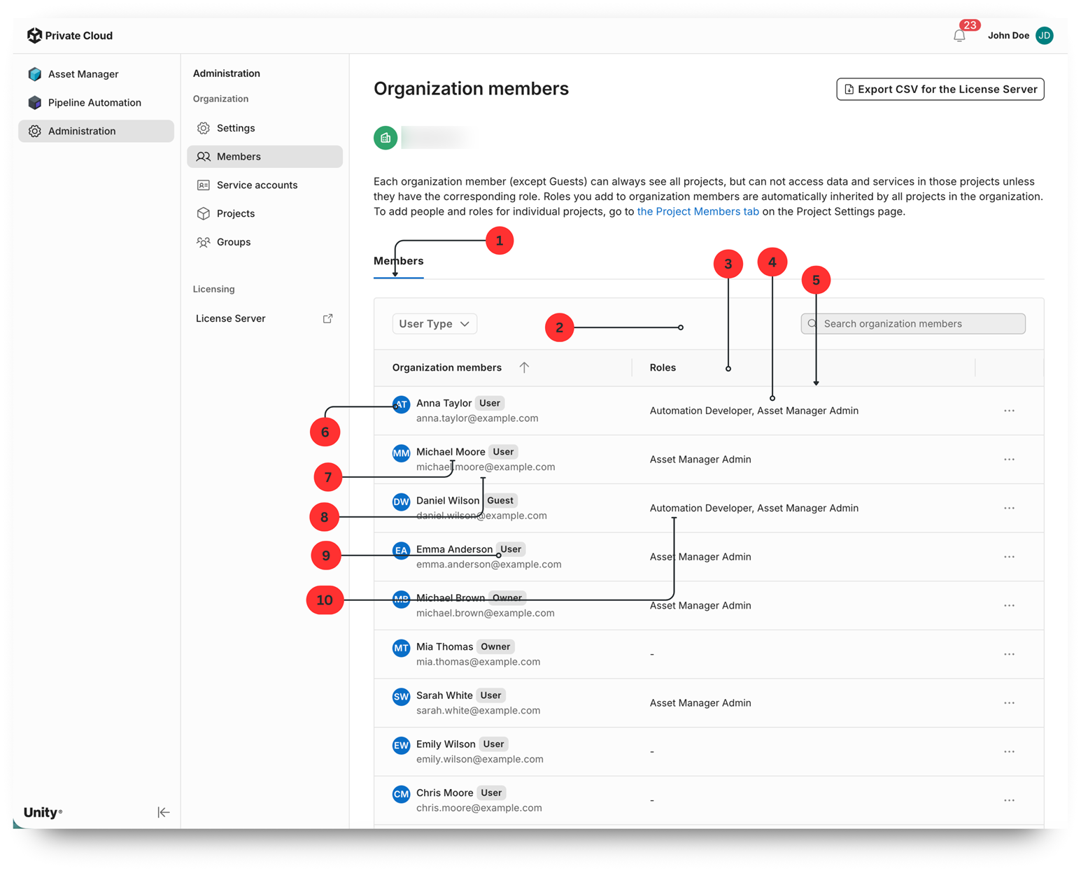
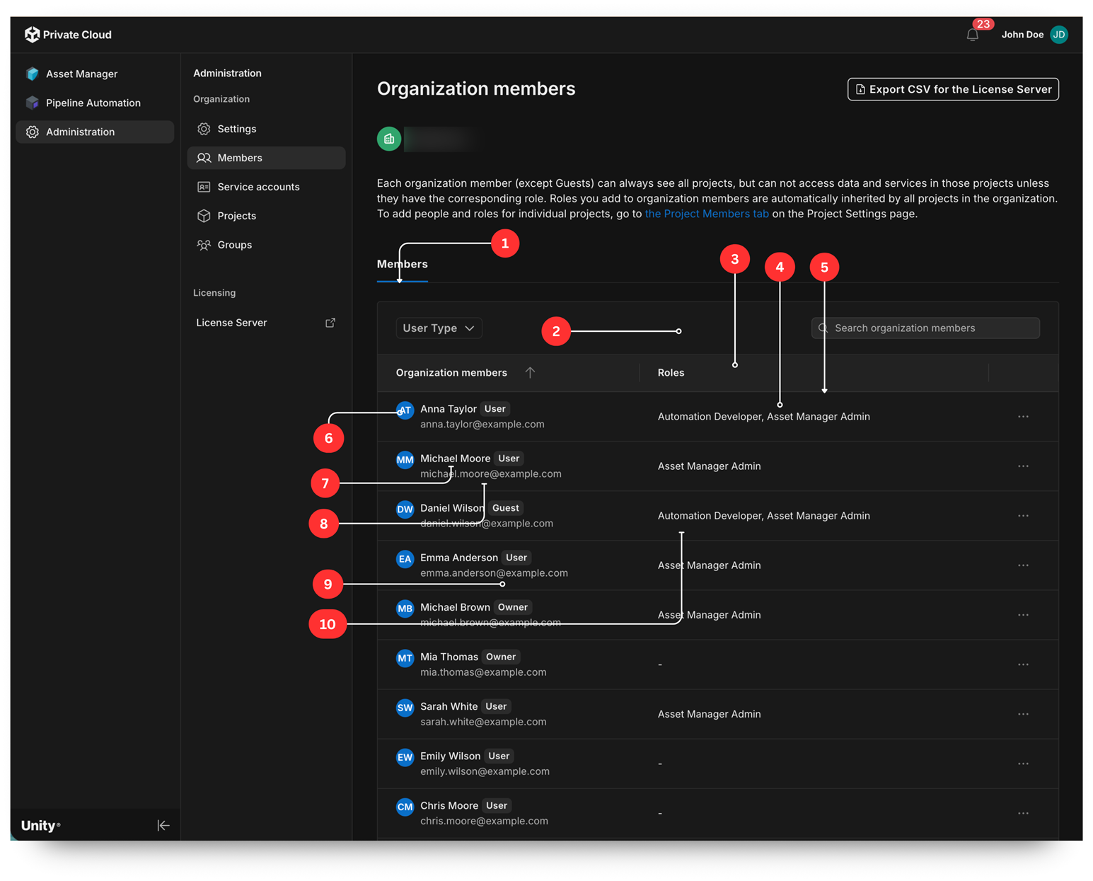
The numbered regions in the screenshots use these palette keys:
- Selected tab indicator (the Members underline):
primary.main - Toolbar above the table (filter and search):
background.paper - Column header row:
background.datagridHeader - Body cells:
background.paper - Border between rows:
divider - Member avatar in the cell:
primary.main - Member name:
text.primary - Email address:
text.secondary - Role and type chip background (such as User and Owner):
divider - Roles list text:
text.primary
Groups table
The Groups tab under Administration > Settings.
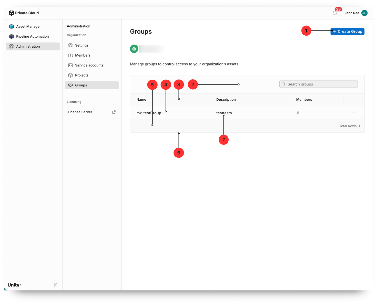
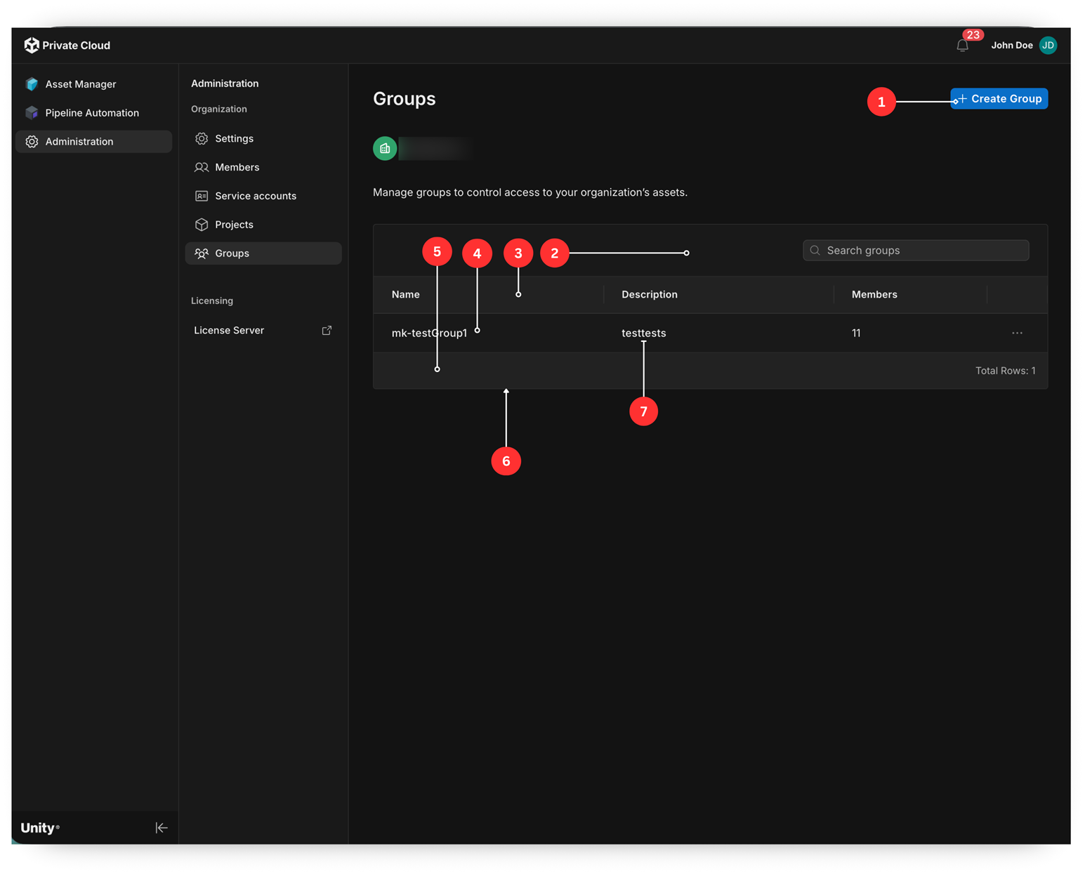
The numbered regions in the screenshots use these palette keys:
- Contained primary call-to-action button (Create Group): background,
primary.maintextprimary.contrastText - Toolbar above the table (search field):
background.paper - Column header row:
background.datagridHeader - Body cells:
background.paper - Pagination footer:
background.datagridHeader - Borders between cells and rows:
divider - Cell text:
text.primary
Asset Manager list view
The list view of All assets in Asset Manager. This view is rendered by the embedded Asset Manager submodule, which inherits the Unity Dashboard palette.
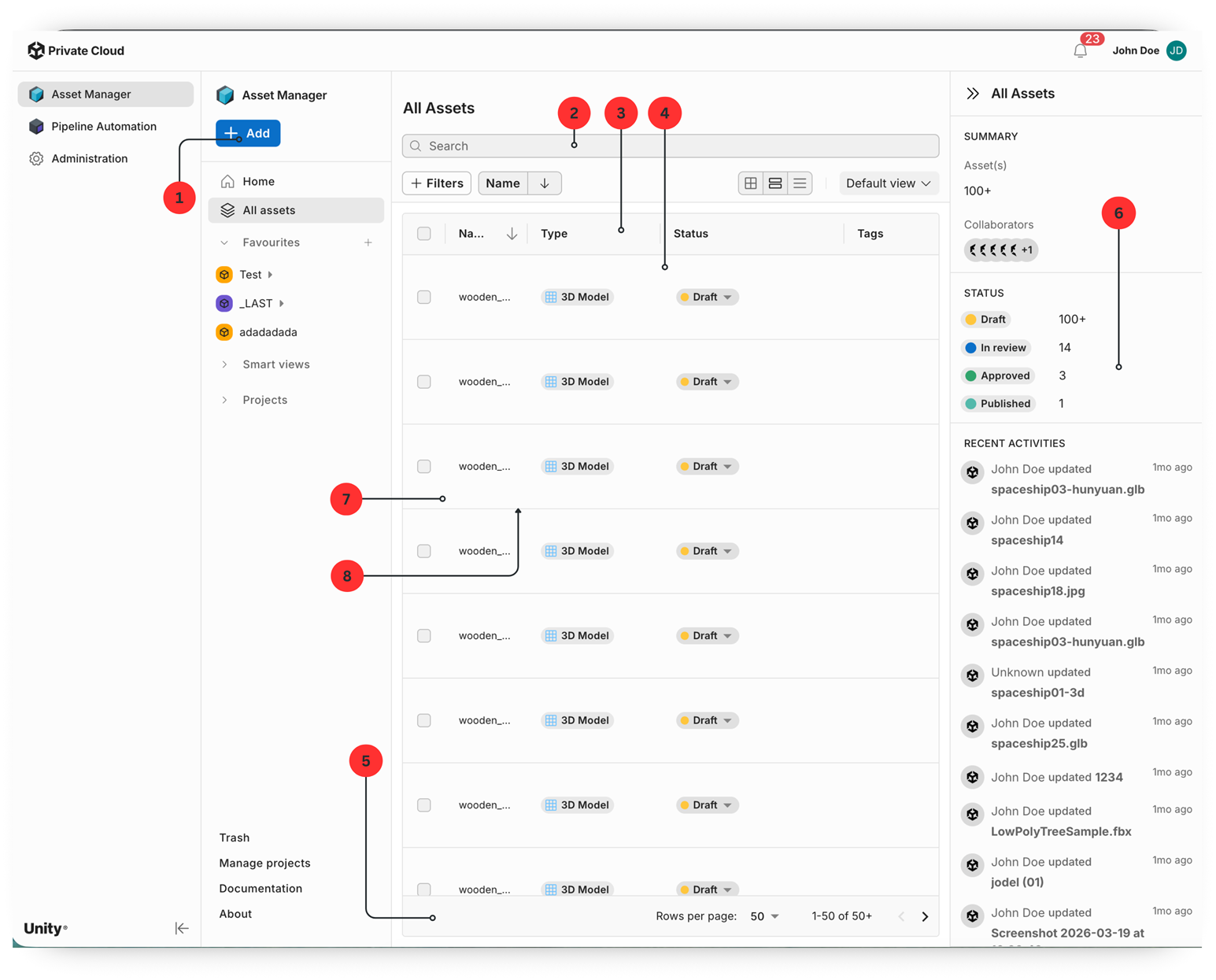
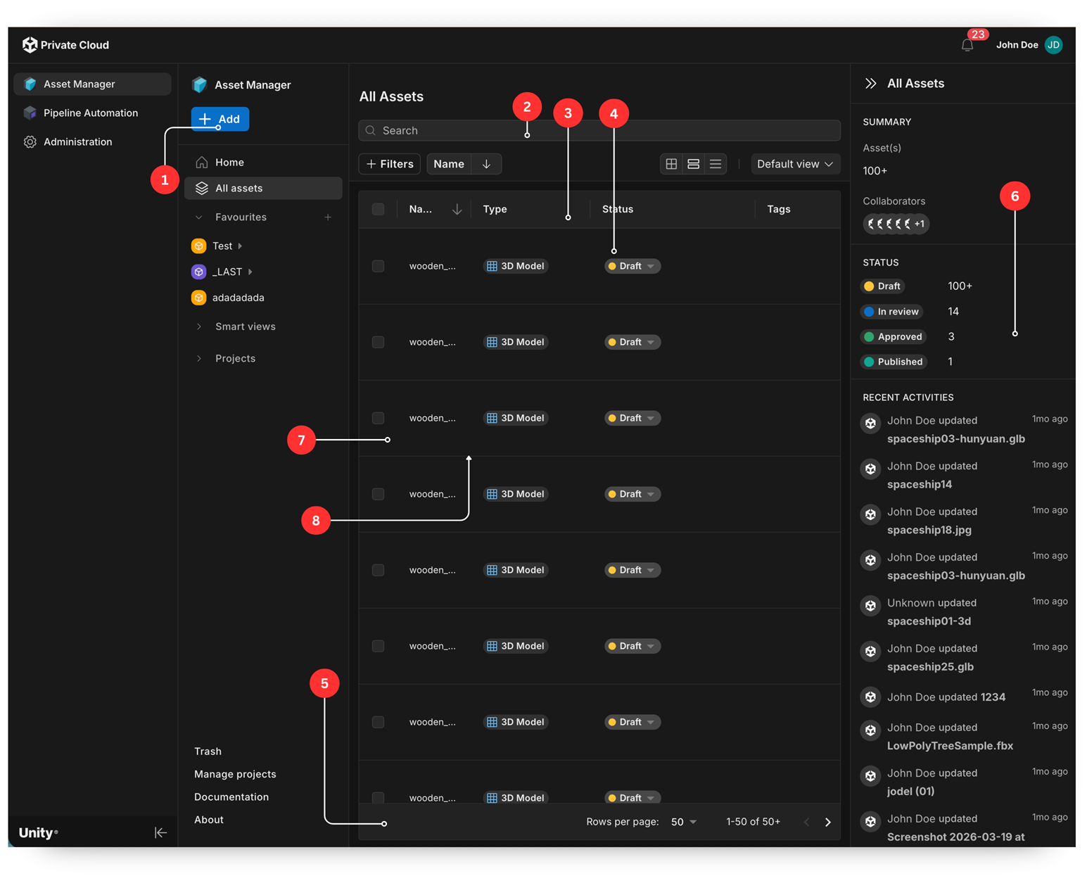
The numbered regions in the screenshots use these palette keys:
- Contained primary call-to-action button (+ Add):
primary.main - Toolbar (search, filters, view switcher):
background.paper - Column header row:
background.datagridHeader - Row under the cursor:
background.paperElevation0 - Pagination footer:
background.datagridHeader - Right context panel (summary and recent activity):
background.paper - Body cell:
background.paper - Row borders:
divider
Selected row and side panel
The state when a row is selected in the asset list, which opens the side panel and the selection toolbar.
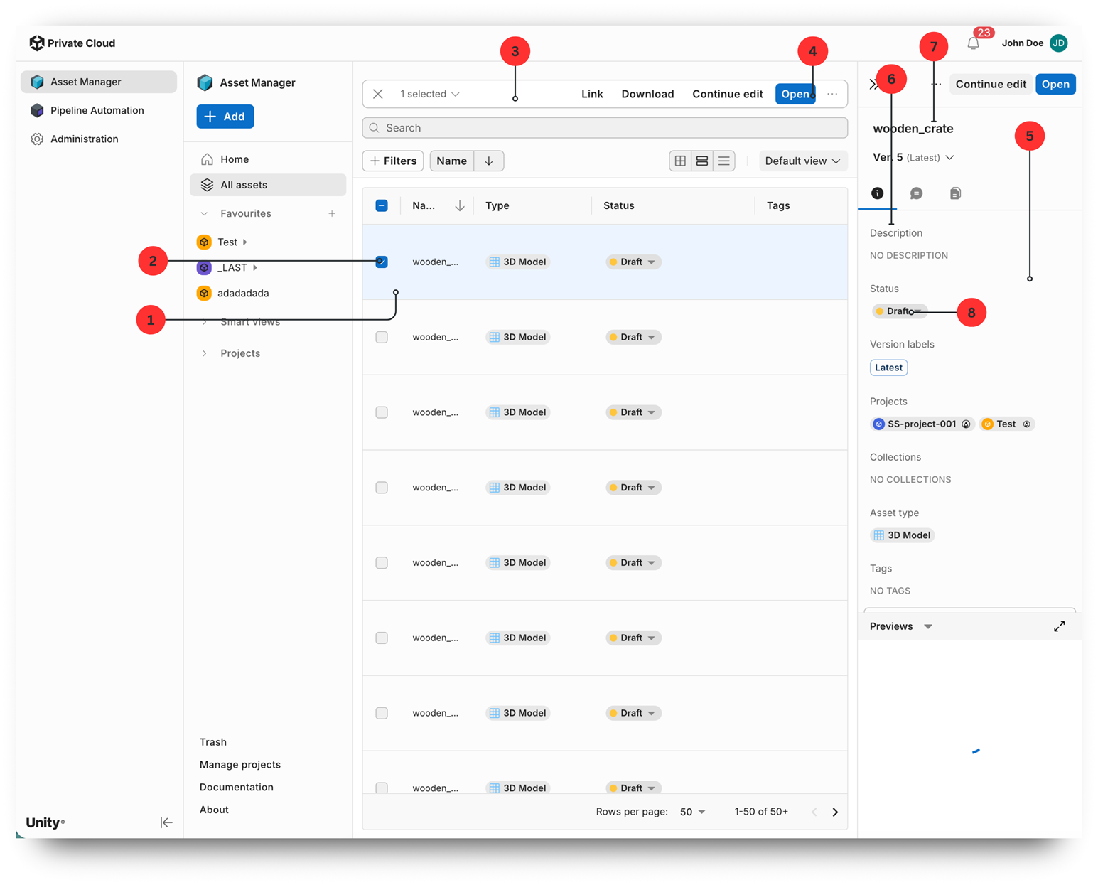
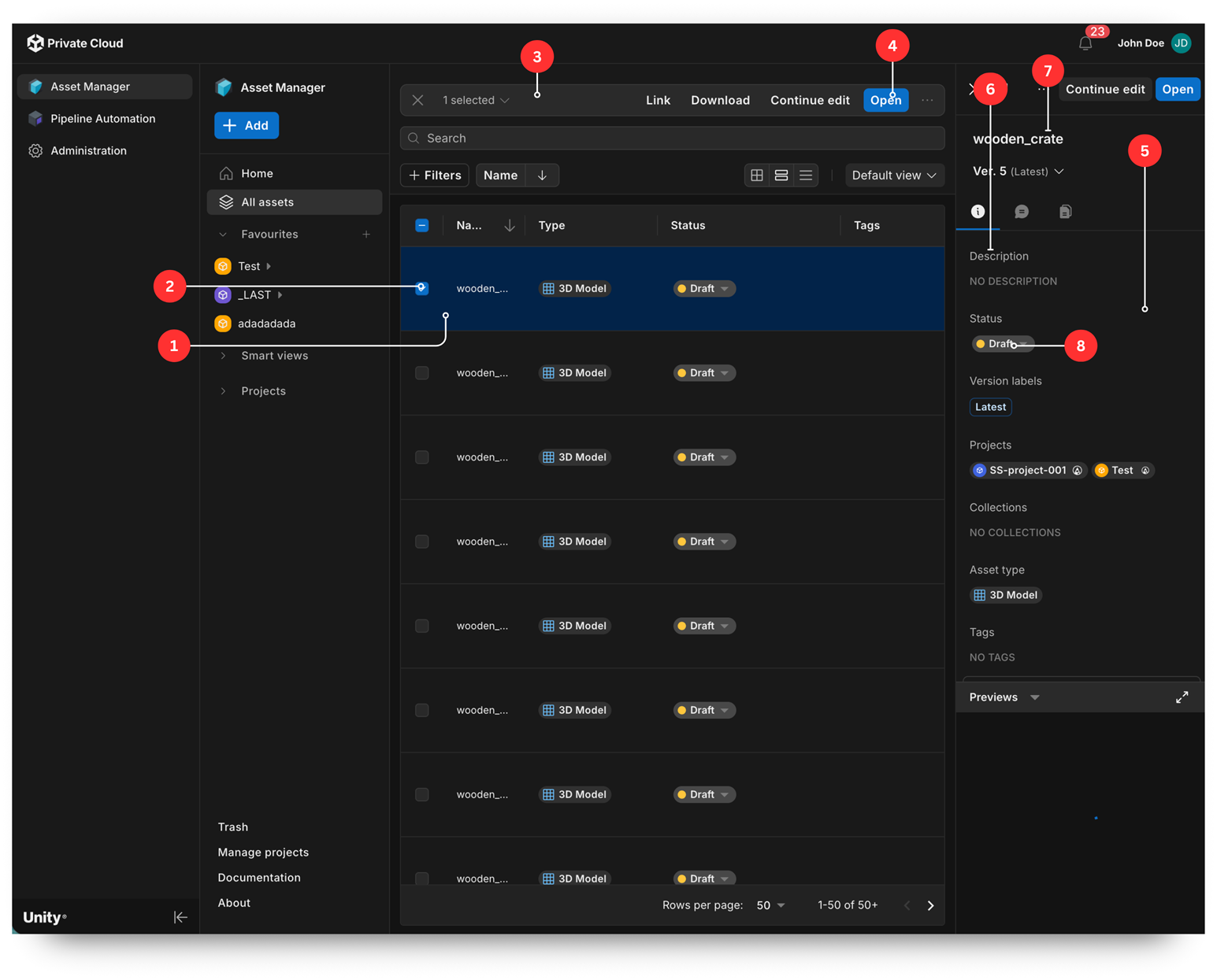
The numbered regions in the screenshots use these palette keys:
- Selected row background:
primary.lighter - Selected row checkbox:
primary.main - Selection toolbar (1 selected, Link, Download, and so on):
background.paper - Contained primary call-to-action button in the toolbar (Open):
primary.main - Side panel surface:
background.paper - Section labels in the side panel (Description, Status, Projects):
text.secondary - Asset name:
text.primary - Project chip background:
divider